Back in 1980 the saying “more is more” was to be uplifted to new heights: Vibrant colors, extreme shapes, an unseen body cult and design eclecticism were to become the most important ingredients of this era. The 80s design exhibition at the MAD Paris shows the feast of design this decade was.
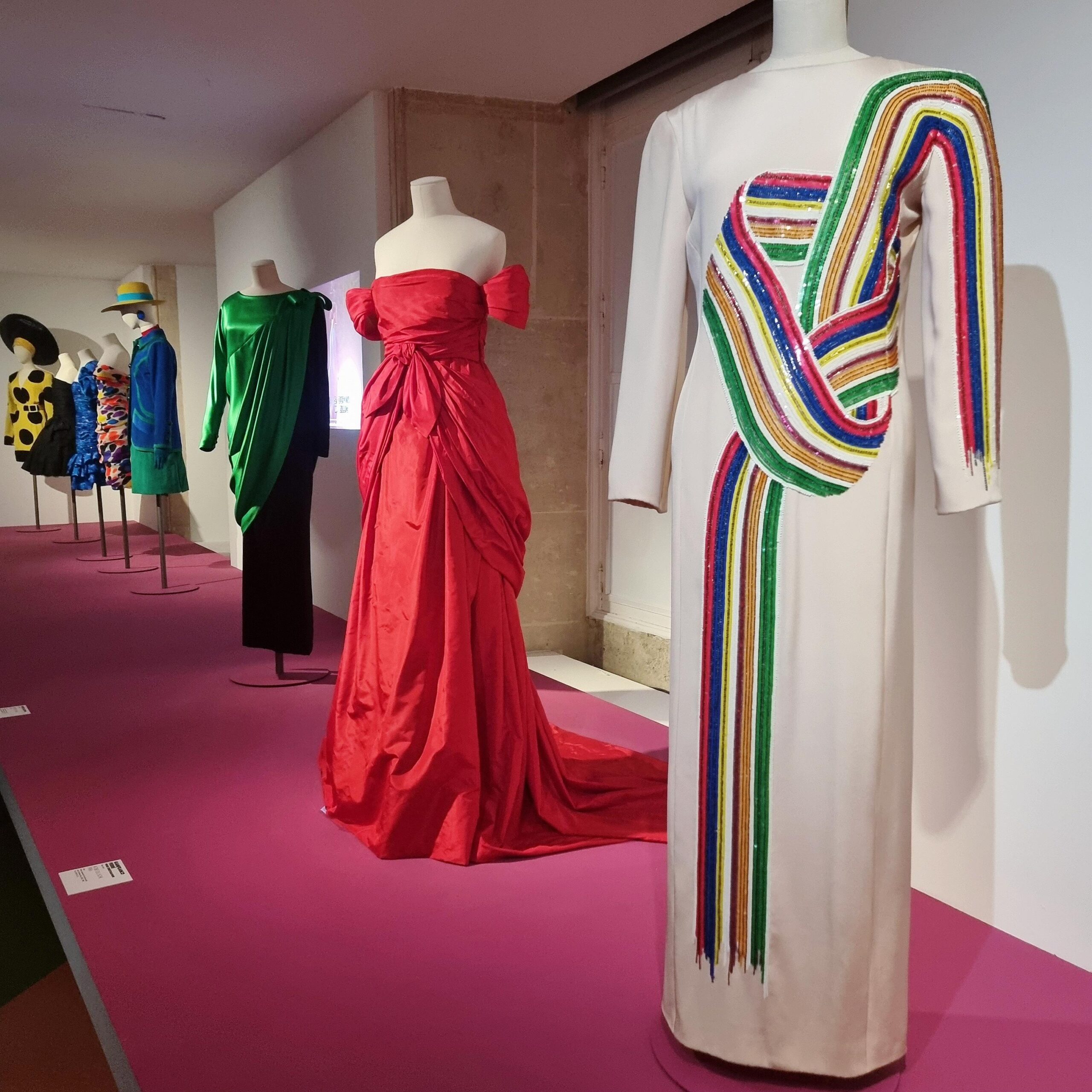
But what is it, that comes to our mind when we think of the 80s? It is the time when Madonna, Michael Jackson, and Blondie became big. It is the decade when designers like Thierry Mugler, Christian Lacroix, and Jean Paul Gaultier redefined fashion. It is the era of Joan Collins, Dolly Parton, Tina Turner or Silvester Stallone – their images were all about the celebration of the powerful human body and the iconic bling of this era.
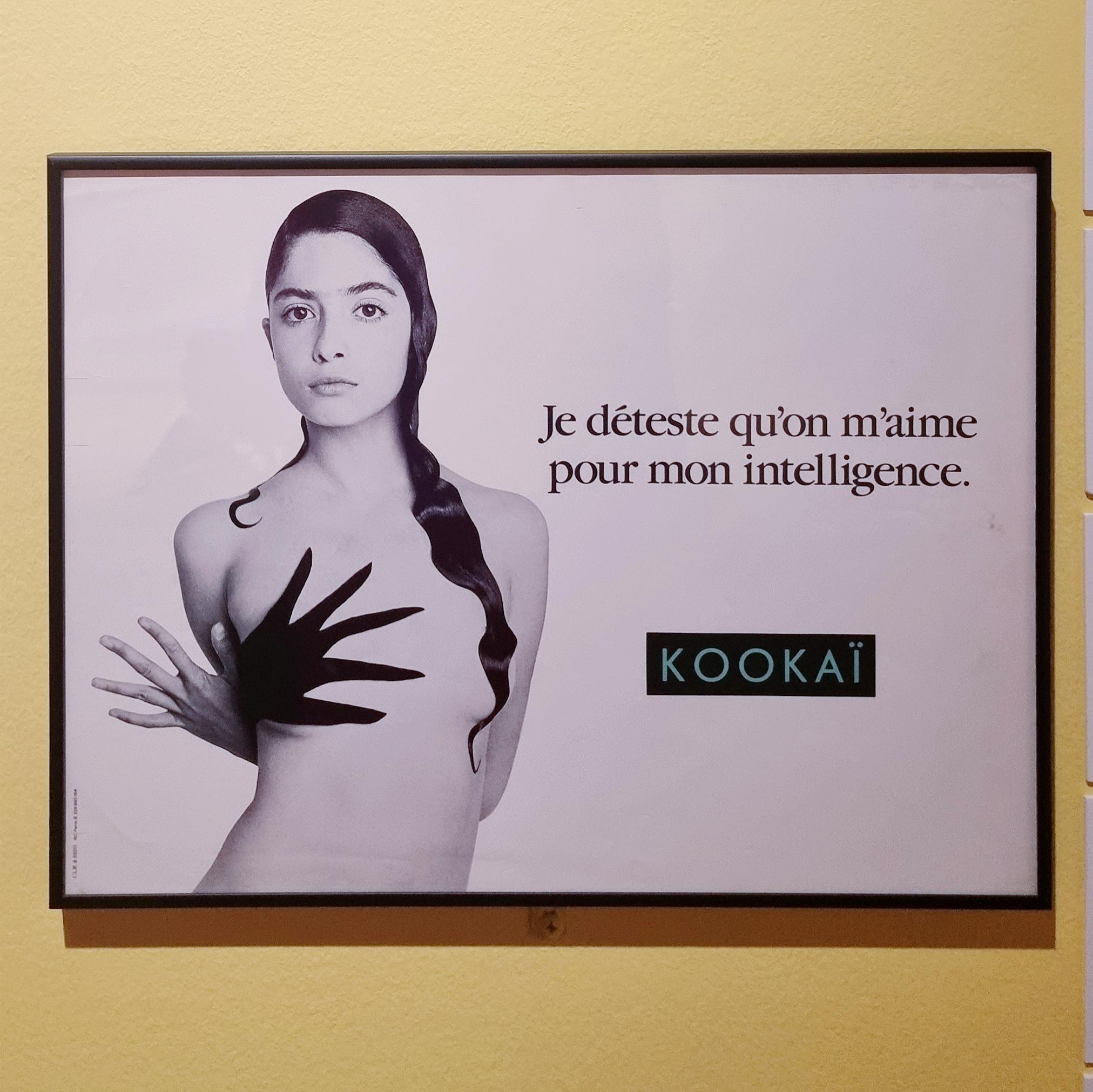
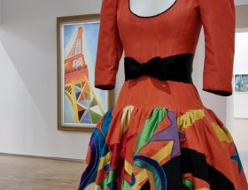
The 80s design exhibition at the Musée des Arts Décoratifs in Paris focuses on the French contributions to the 80s and does, what I love most: It has no fear of mixing the disciplines and showing fashion, interior and graphic design one next to the other. The presentation of fashion by Lacroix, Alaiia and Yves Saint Laurent as well as design by Philippe Starck, Martin Szekely and Jean Paul Goude make a wonderful job when it comes to reviving this intriguing era.
80s design history is pretty dense and so is the 80s design exhibition at the MAD Paris. For this article I’ll focus on four design aspects, that sum it all up very well in my opinion.
Back to the BASICS
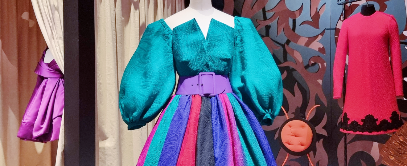
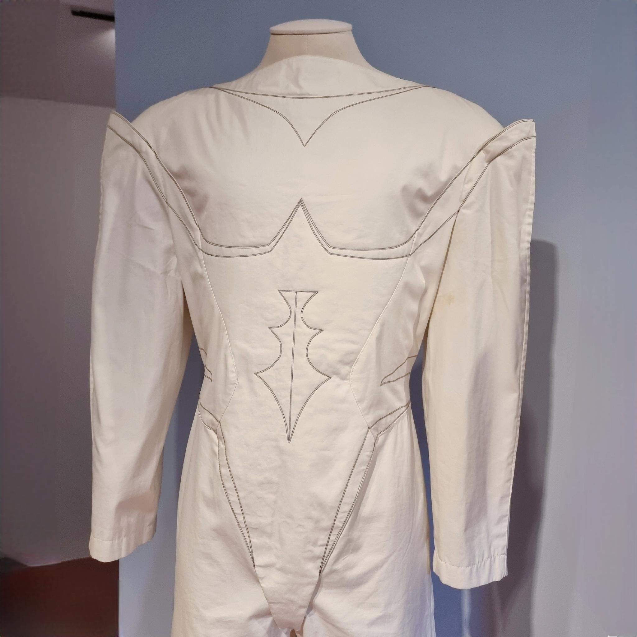
As flashy and bold 80s design was, in a lot of cases it actually worked with the most basic design elements: Strong Lines, basic shapes and geometry often made a typical 80s dress or a chair as the examples of the dress of Pierre Balmain (designed by Erik Mortensen) and the famous chair Miss Dorn by Philippe Starck show.
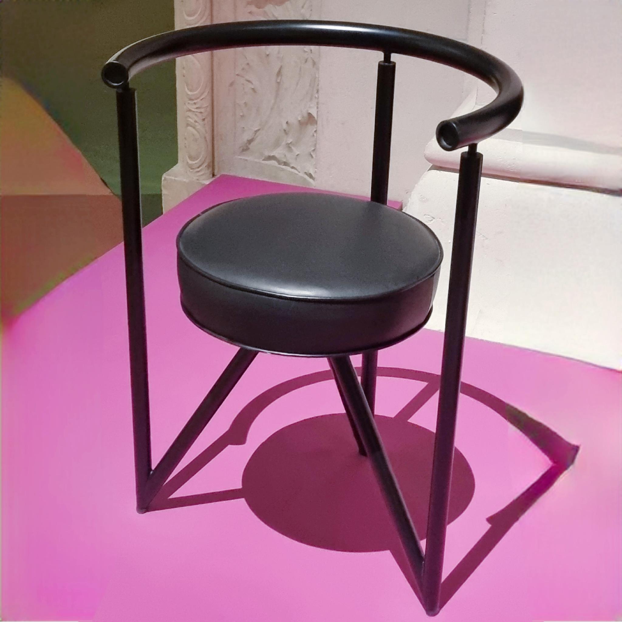
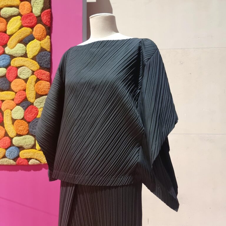
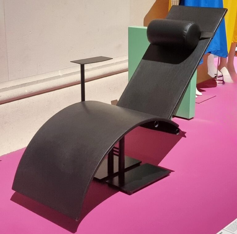
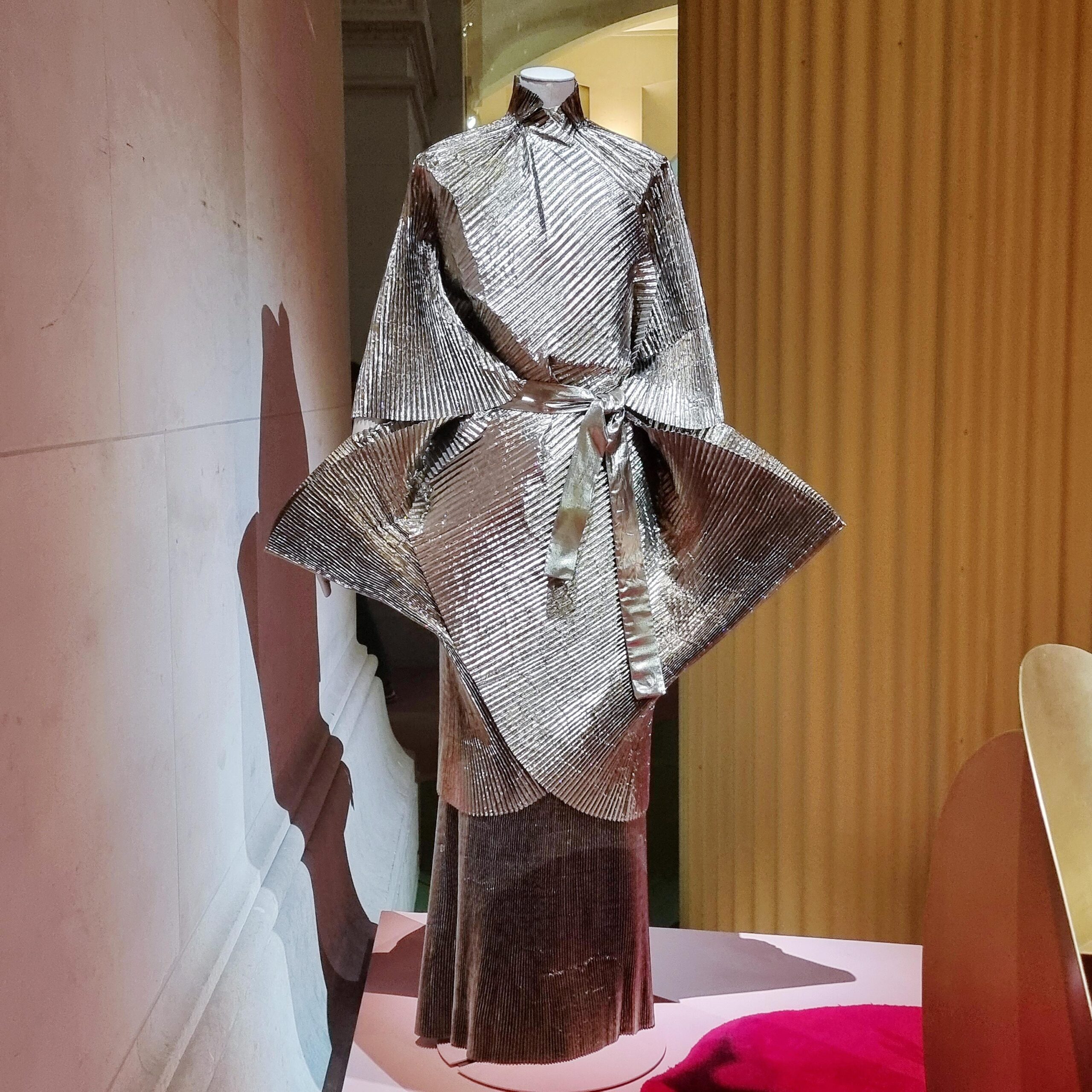
Issey Miyake’s minimal look and Martin Szekely’s wonderful Chaise Longue PI make another example: Both reduce any kind of decorative element to where everything begins (as the painter Kazimir Malevich would coin it): To black squares and rectangles.
PRIMARY colors
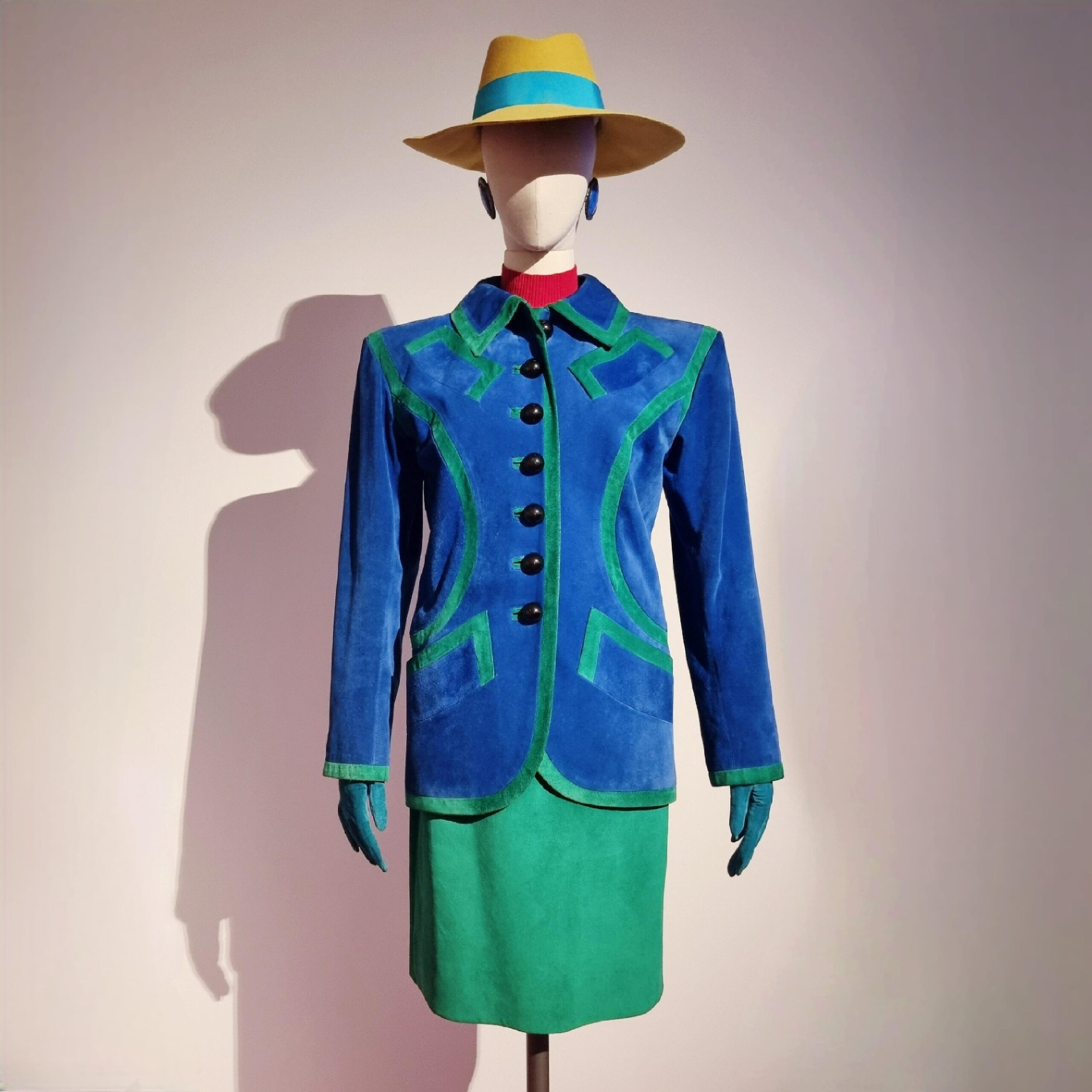
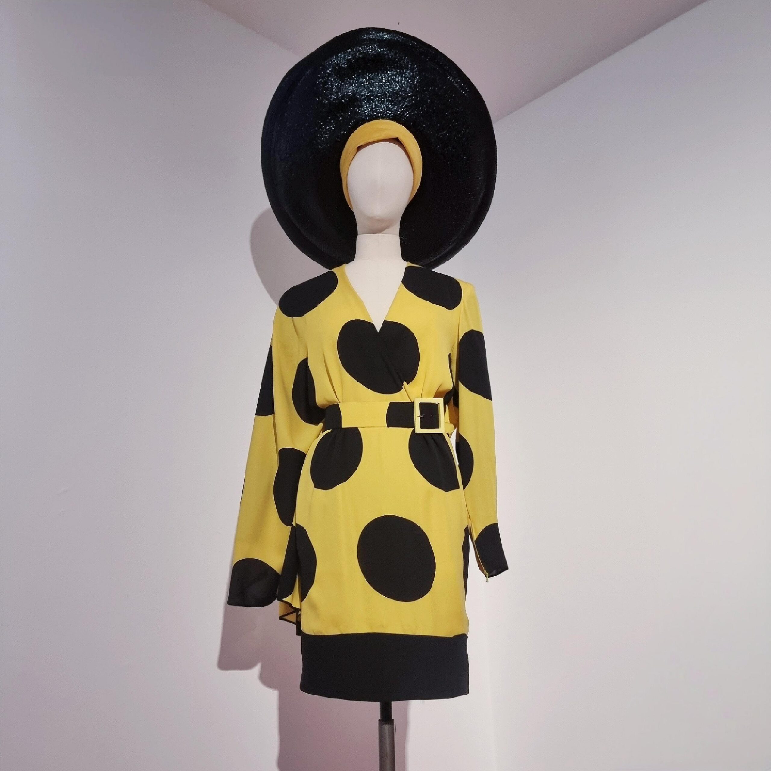
The return to the basics did not halt at the shapes during the 80s. The choice of colors equally is elemental: Apart from the primary and secondary colors black and white were essentials no matter if we talk fashion or interior design.
Displaying POWER
80s design was anything but modest. 80s design was loud, fierce and made to impress. No matter if it is fashion, interior and graphic design – all were made to glorify their wearers, brands and consumers.
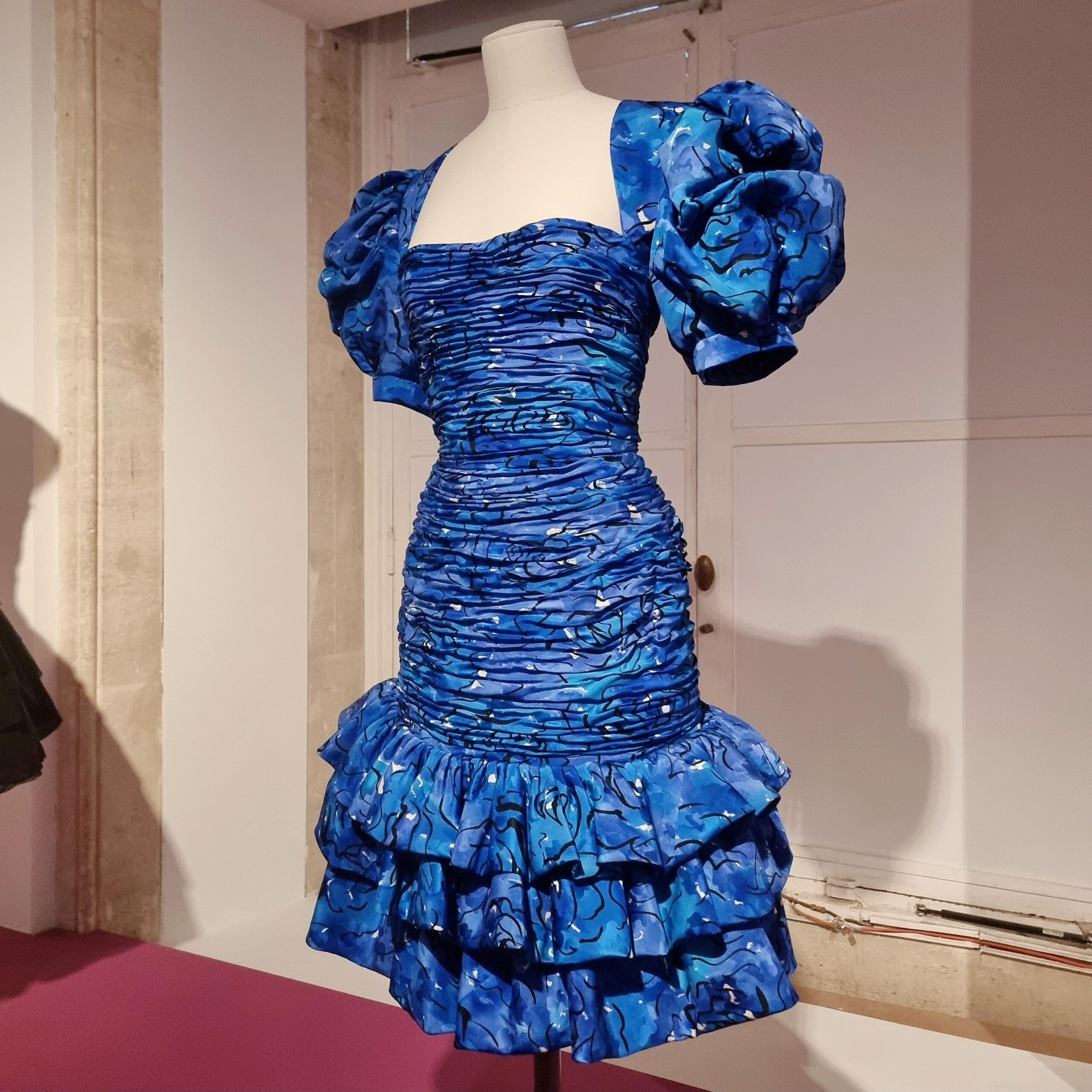
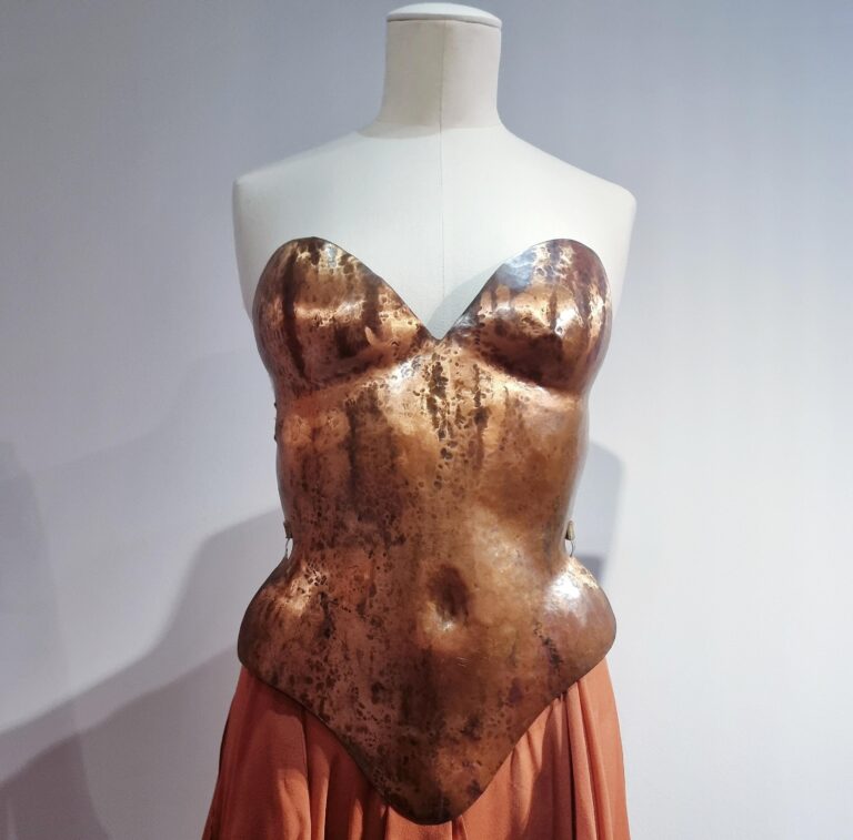
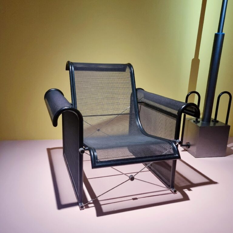
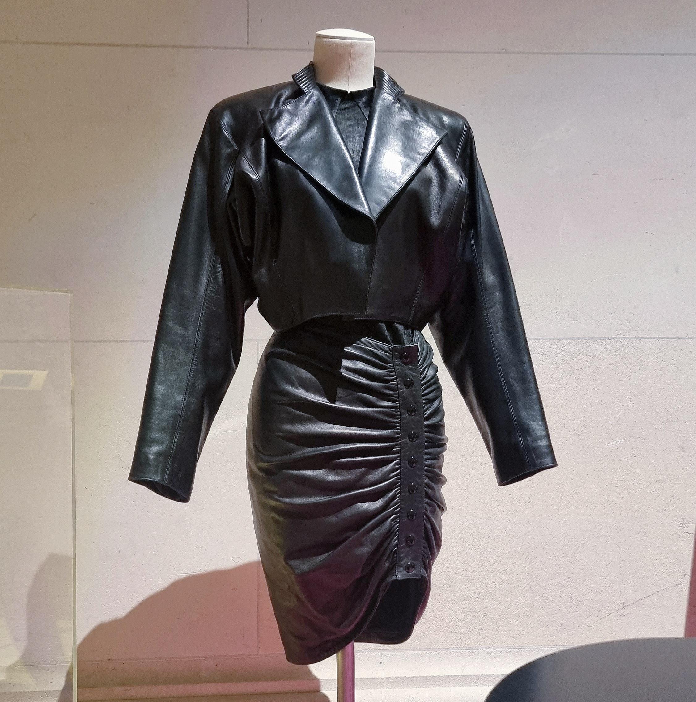
The so-called power dress was developed during this era: Broad shoulders and tight waists were THE goals when it came to the cut and shape of the designs of Mugler, Gaultier, Montana etc. Interior design followed a similar credo: The mesh chair by Ronald Cecil Sportes with its expansive shape and rigorous metal looks like an 80s throne to the sitter and his or her probably equally powerful fashion. Imagine Brigitte Nielsen wearing Claude Montana sitting in this Sportes chair and you’ve immediately got a still life of the era.
Fragmenting the BODY
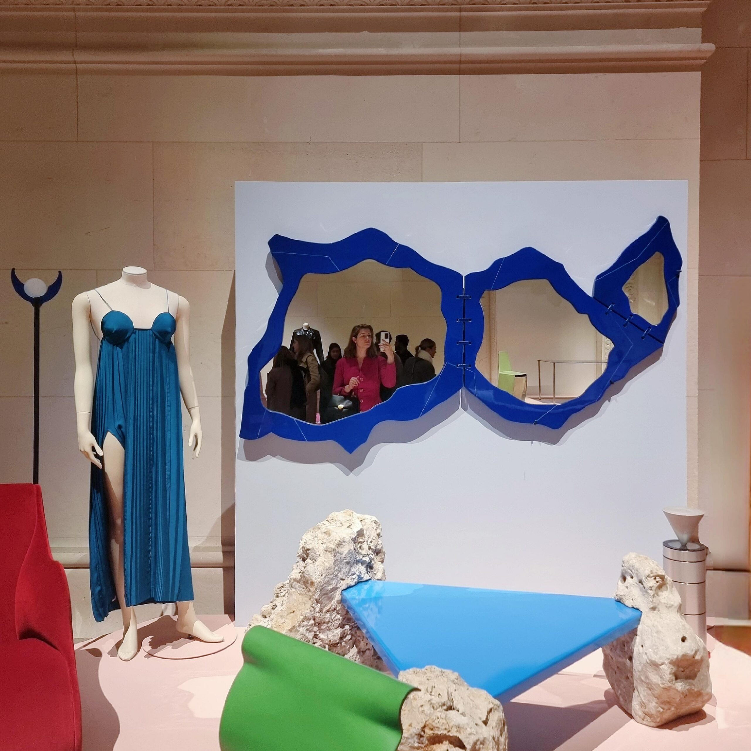
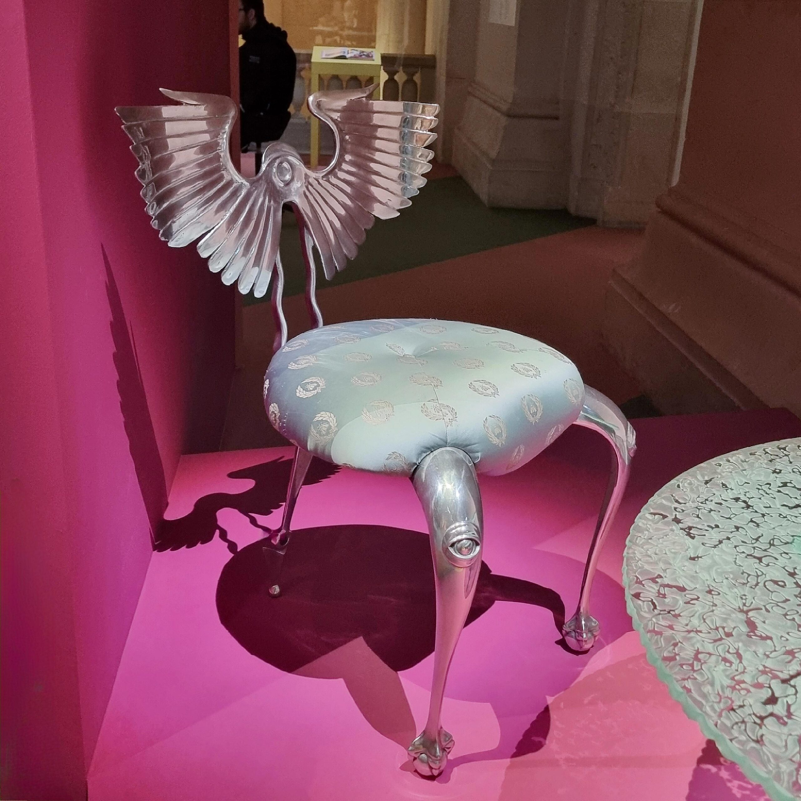
Not only did designers of the 80s celebrate the (toned) body – by its fragmentation they even emphasized its proportions to unseen compositions. No matter if it was fashion or interior designers often opt to exaggerate its lines and shapes and even added body elements playfully.
The 80s are often laughed at these days. The flashy colors and super broad shoulders, the extreme hair styles and ridiculously heroic looks often seem pretty cartoonish from our perspective. I tend to think of this era as a decade of extreme creative freedom – the 80s have that feeling of living utopia to them. More is more was not only their aesthetic credo. It also stands for an endless freedom of style. And while some dresses and chairs seem to be stuck in their era, some on the other hand look incredibly timeless and therefore desirable, as the 80s design exhibition at the MAD shows very well.
