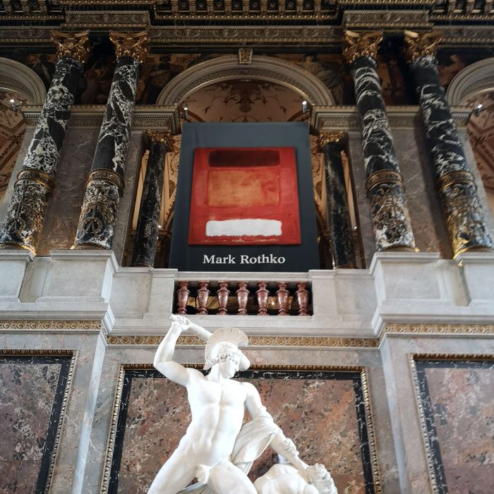
Rothko’s first ever visit to Vienna – at a SURPRISING RESIDENCE
Although the idea of museums of Classical Art showing Modern Artists is neither new nor earth-shattering anymore, Vienna’s museums (in comparison to international houses) are still rather reluctant to curate SURPRISING ENSELMBLES. Visiting a Rothko exhibition inside of the classical museum halls of the Kunsthistorisches Museum is therefore particularly exciting! So many triggering questions appear immediately on my mind: What does Rothko have in common with Classical Art? How does Abstract Expressionism communicate with the Old Masters? How will the museum introduce a modern icon to the holy halls of the classical painter princes? After the KHM’s wonderful exhibition “The Shape of Time” I really expected a lot of striking, refreshing statements.
Already the entrance situation is making a point: Canova’s iconic “Theseus defeating the centaur” is flanked by an ecstatically red Rothko hanging above the sculptural group. Pure NARRATION meets pure MEDITATION. An equal drama is portrayed – here and there. A wonderfully contrasting setting, promising more of its wonderful contrast!
MODERN inspirations
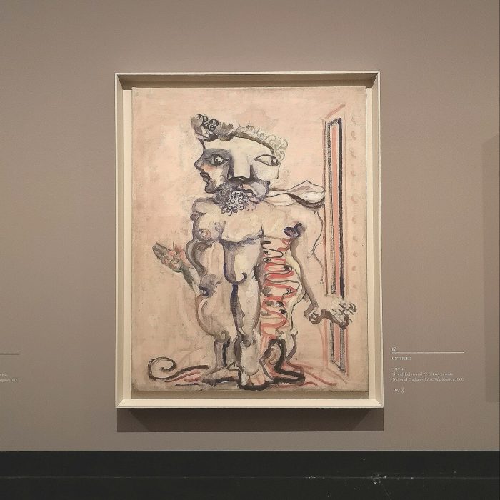
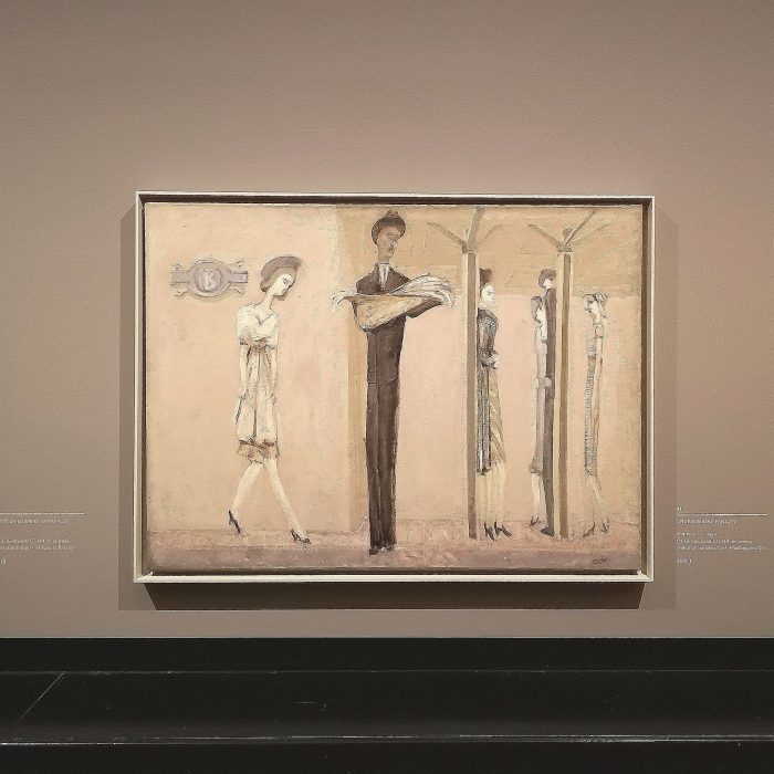
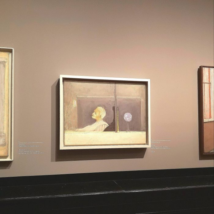
The exhibition presents a chronological survey of Rothko’s work. Starting with his early figurative paintings the retrospective traces the artist’s parcours to his iconic style full of color (fields). Rothko’s early works are rarely presented – so it’s a wonderful occasion to see how he gradually worked through Modern Art’s flows, trying out the ideas of Surrealism and Cubism among others. Finding the organic forms inspired by Yves Tanguy, the empty spaces of Giorgio de Chirico or the slim figurines similar to Alberto Giacometti’s along Rothko’s path to his own stylistic language is a blast. Only this first room is already worth the visit!
CLASSICAL idols
A huge focus of the exhibition is put on Rothko’s INSPIRATIONS: The artists’ extensive trips to Europe and European Classical Art are well documented and give an insight into his passion for GIOTTO, MICHELANGELO, TITIAN, REMBRANDT and many more. While Rothko is usually put in the context of Abstract Expressionism and mentioned along Barnett Newman, Jackson Pollock and others, seeing his classical inspirations means a very REFRESHING discovery, counteracting art history’s traditional narration. It shows how Modern Artists (in that case post-war artists) actually did not ‘leave everything behind’ but on the contrary built a style upon ideas of the Old Masters.
Especially the exhibition hall focusing on Rothko’s adoration of Michelangelo’s Laurentian Library wonderfully illustrates how Classical Art inspired Rothko’s abstract compositions. With the help of beautiful black and white photos of the Florentine interior architecture you can easily discover how simple and how great the compositional relation between the two is. How architecture inspired painting. And how the Renaissance’s quest for the IDEAL composition was just as present in POST-WAR ART.
I pretty much was in heaven at this part of the exhibition (AGAIN – after discovering Rothko’s relations with my modern cheris!).
Looking for FACTION
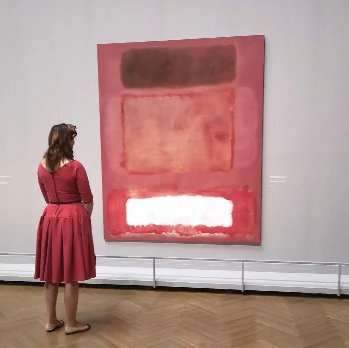
All in all, the exhibition is a neat retrospective showing the wonderful works and inspirations of Mark Rothko. From a visitor’s and art historian’s point of view, strolling through the show means diving in into a beautifully staged ARTISTIC UNIVERSE.
From a museologist’s point of view on the other hand, visiting this specific Rothko exhibition leaves the flavor of a missed OPPORTUNITY. I somehow left the show with a feeling of disappointment, although the exhibition makers did everything right and kept all promises.
But wait a minute, did they? Let’s get back to the redly flanked Theseus, who welcomed me on the staircase! His charm came from its UNCONVENTIONAL combination of Classical and Modern Art. From the contrast between Figuration and Abstraction. From this pure promise of FACTION actually.
So the question is: Was the factionate promise of the entrance fulfilled inside of the exhibition? Well, only partly, I’d say.
Locating a rather isolated ROTHKO

Let’s talk about the exhibition’s location first. The Rothko show is – similar to other temporary exhibitions at the Kunsthistorisches Museum like “Spitzmaus Mummy in a Coffin” – centrally located in a few halls and galleries, isolated from the permanent collection. So once you enter the temporary exhibition you walk through it (almost) without seeing the artworks permanently on view (you are able only to see glimpses of them at the ends of the special show halls, since the passages are open). So the beautiful meeting at the entrance does not at all continue inside of the exhibition. Most paintings are hung on grey partitions especially designed for the show. Beside some parts of the KHM’s classical interior and the pleasant creaking of the wooden floors, you hardly get a hint of where you are.
Classical MUSEUM vs. grey CUBE

Now, the question is: Why is the exhibition that isolated? Why are Rothko’s works shown not next to the Old Masters? Why is the whole setting of the exhibition mostly changed to a cleaner design? Why did the KHM choose an exhibition design, that sometimes looks like a gallery space (a grey cube in this case) than rather sticking to their own fabulous interior? What’s the point in showing an isolated retrospective gallery-style in the middle of a world famous, 19th century interior?
Aspiring to stage an OUTSTANDING retrospective
You see, where I’m heading to: Despite the above mentioned well illustrated Classical Art inspirations, almost nothing recalls the fact, that the Kunsthistorisches Museum is staging this retrospective and no other museum. Why not put a Rubens Madonna next to a Rothko when talking about spirituality? Why not take a classical DRAMA of Anitquity and stage it next to a red, ABSTRACT masterpiece?
THAT would be wonderful. THAT would be an eye and mind opener. THAT would stand out from the many Rothko retrospectives that are shown worldwide. And THAT would be the monumental reason why the Kunsthistorisches Museum should and could do this and no other museum.
(Possibly) criticized COURAGE
Now, I know, that this kind of curation could be too courageous for several reasons.
First, Rothko himself was very reluctant to show his work next to other paintings, refusing many group shows throughout his career. An exhibition maker could fear curating too offensively while ignoring Rothko’s wish. But the thing is, Rothko refused to be shown with his contemporaries not classical artists (as far as I know of course), which should be a game changer when it comes to the above mentioned possible CONTROVERSY.
CONTENT taking the STAGE
My plea for more courage at the museum also touches the question of how far curators should go and transform the PERCEPTION of art with the staging of an exhibition. Considering this very specific example, I really want to stand up for the rights of exhibition developers! There’s been so many exhibitions of both art chapters: The classical KHM collection as well as Rothko’s works. I have seen so much Classical Art all over the world as well as many Abstract Expressionist paintings – and I have forgotten many of them, I openly admit. But forgetting a Renaissance Madonna next to a Rothko? A Rembrandt next to a Rothko self-portrait? Hardly possible.
It’s really time to PROVOKE new thoughts and SHOW surprising aspects (which was the case at the KHM!) But it’s not only the content, it’s also the staging, that needs to be striking.
About the fear of EDUCATING too obviously
Some people might also fear a too DIDACTICAL approach. Fear to make a too strong statement, to stage a too obvious, too simple, maybe even childish argument. Well, as a former art educator I can tell you: There is no too obvious staging and educational design, if you keep the style clean. You shouldn’t be thinking of many Madonnas hanging next to many Rothkos. Just image that huge grey wall showing ONLY ONE classical and ONLY ONE abstract painting. That wouldn’t be cheesy. That would be ONE OF A KIND. And it would be a blast.
The museum as an atmospheric PARENTHESES
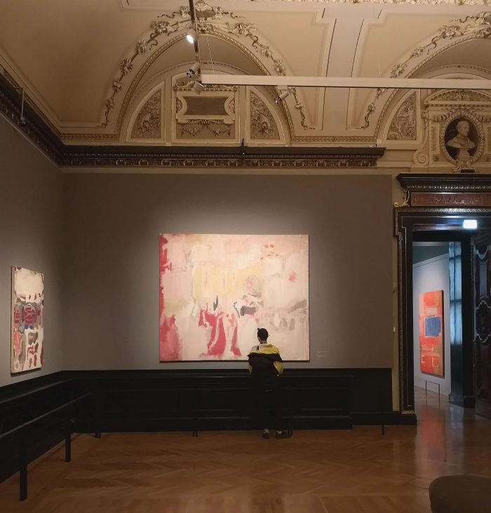
So, what the exhibition makers decided, is to show a Rothko retrospective within the frame of the classical permanent collection. To use the atmosphere of the museums’ interior and collections’ meaningful stories to flank the Rothko show and its focus. Which is totally fine. Of course the place offers a specific ATMOSPHERE anyhow – no matter if you see the interior or the classical paintings – I do agree on that.
#TeamPRUDENCE vs. #TeamCOURAGE
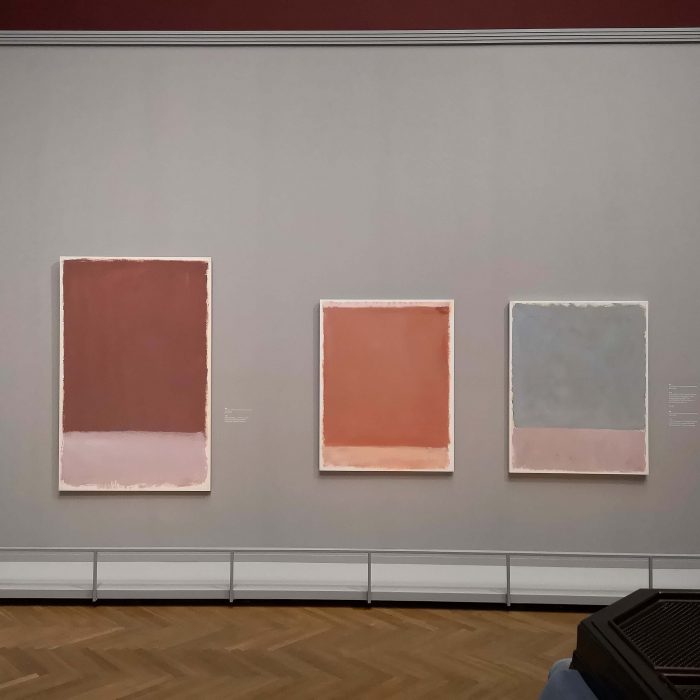
Still I have to say, that the FACTION potential wasn’t exhausted. There would have been so many opportunities to go further when pointing at the same topics, the similar mentality or the similar colors of both universes. The way the KHM portrayed the relations between the two worlds is certainly very prudent. But in this case I clearly opt for #TeamCOURAGE, not #TeamPRUDENCE. The wonderful promise made on top of the KHM’s staircase was not really kept – at least not for me.








Thank you for your kind words!
I have learn some just right stuff here. Definitely price bookmarking for revisiting.
I surprise how a lot effort you place to make this
sort of fantastic informative website.